Case Study: Building a Scalable Design System for Practice Fusion
OVERVIEW
Practice Fusion, a leading cloud-based electronic health record (EHR) system, required a scalable and consistent design system to improve usability, accelerate development, and maintain brand consistency across its product suite.
This project centered on UI design and standardization, creating a strong foundation for a consistent and seamless user experience.
As the UI Designer, I was responsible for:
Ensuring adherence to accessibility standards
Designing high-fidelity UI components in Figma
Maintaining scalability and flexibility for future design iterations
Problem
Practice Fusion’s UI lacked consistency, with disjointed components, inconsistent branding, and accessibility gaps, leading to a fragmented user experience. The absence of a unified design system caused inefficiencies in design-to-development handoff, forcing developers to rebuild components from scratch. Moreover, usability challenges and non-compliance with WCAG standards hindered accessibility for healthcare professionals.
Solution
To address these challenges, I developed a comprehensive design system that standardized UI components, ensuring consistency, efficiency, and accessibility across the Practice Fusion platform. By creating a structured component library, I eliminated the need for redundant design work, allowing designers and developers to work more efficiently.
Testing & Validation
Being part of a small team, I collaborated with UX researchers to structure Usability Tests in order to validate UI component usability. We also organized small tests with key stakeholders and developers to test button interaction and navigation flow.
Navigation bar issues:
Drop down menu should be standardized with the design system
Users had to click the logo to go back to the home screen.
Inconsistent use of design system components.
Viewport inconsistencies
Lack of a modular grid system to organize components.
Adding a large subheader text explaining it is a 6-week curriculum on the welcome page.
Adding a “Home” button on the navigation bar.
Adding a progress bar of where you’re at on the page.
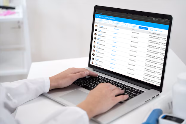
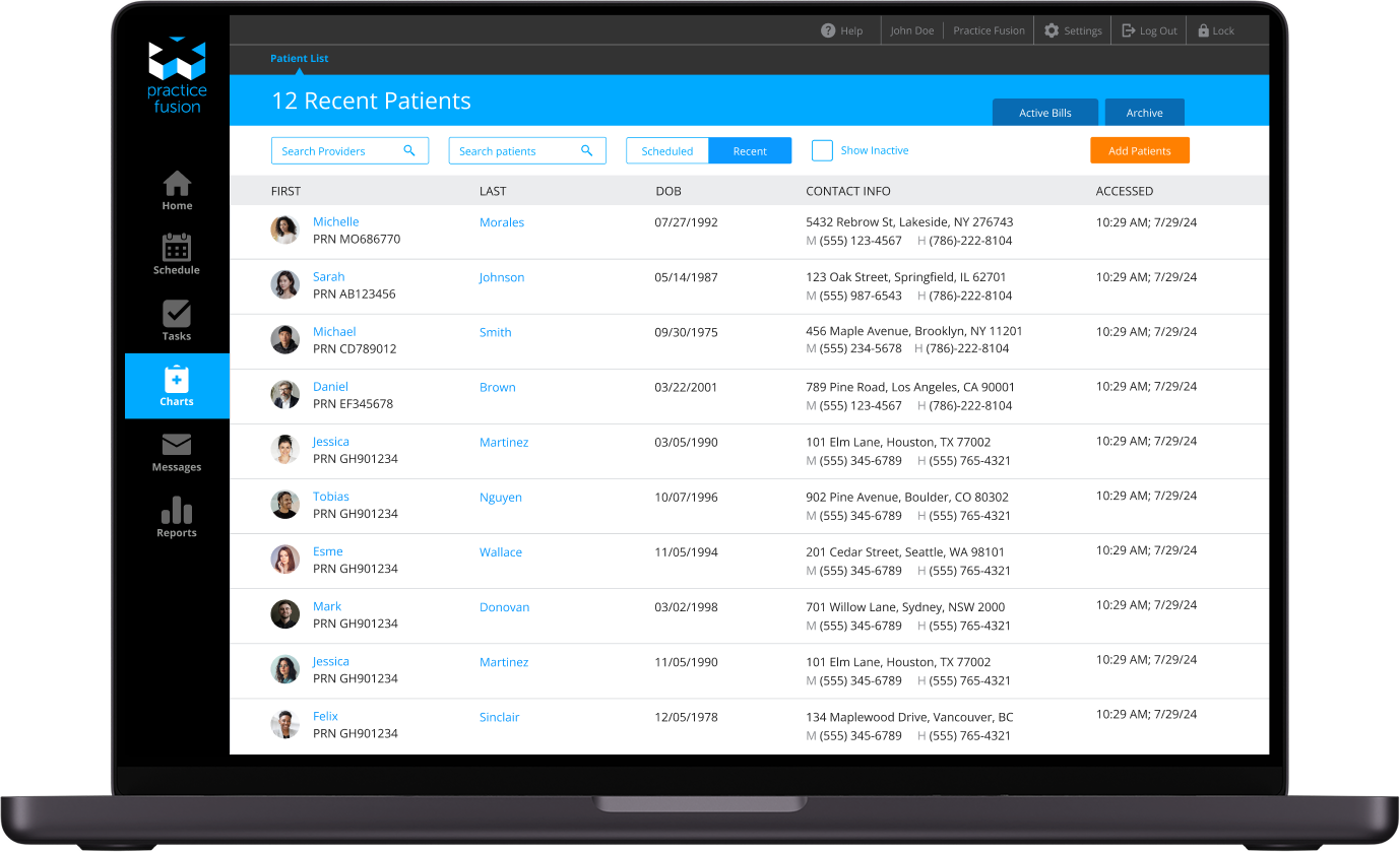
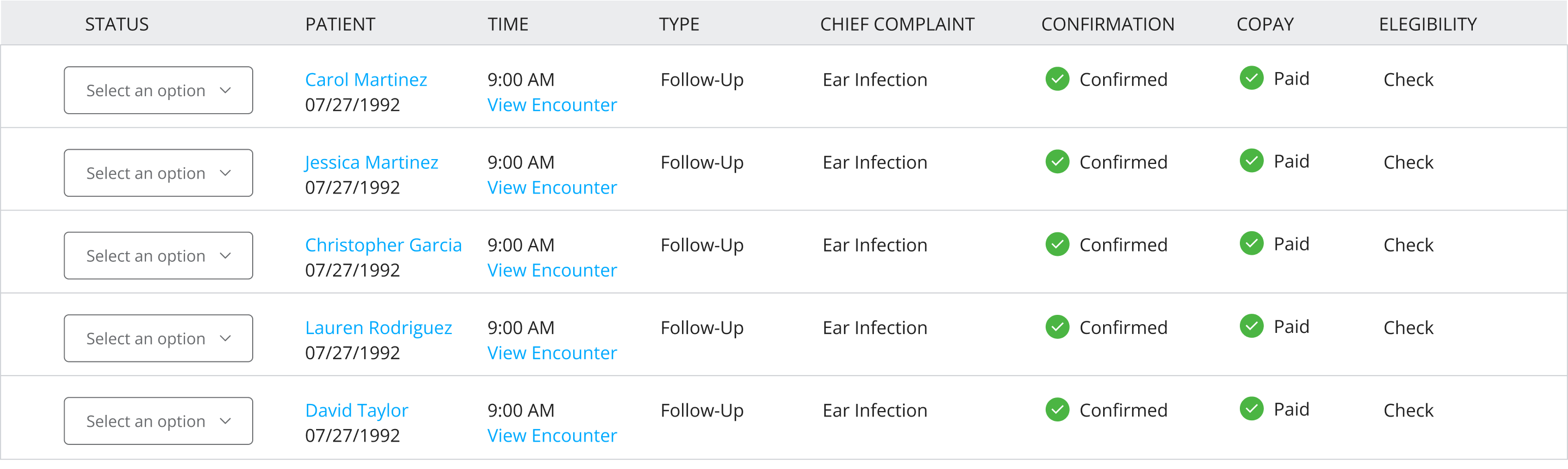
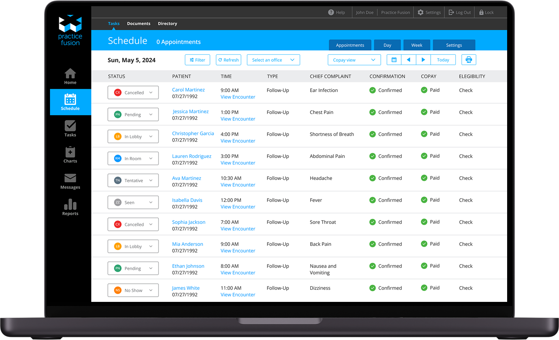
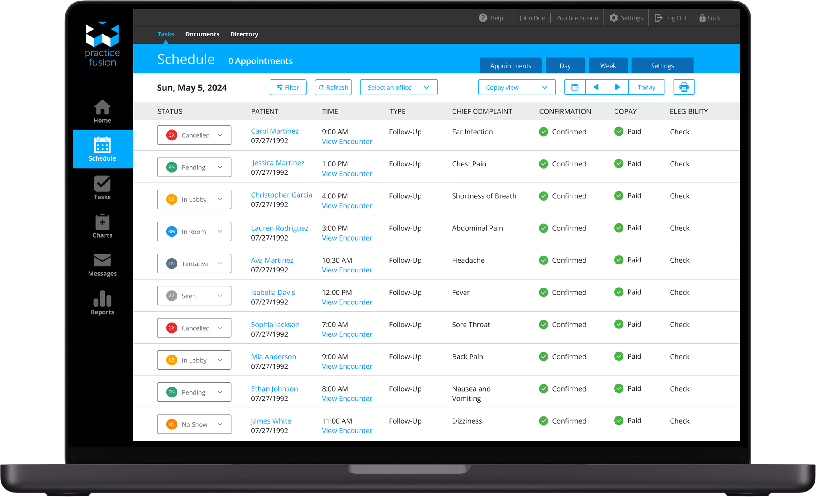
Patient Chart Screen – Practice Fusion
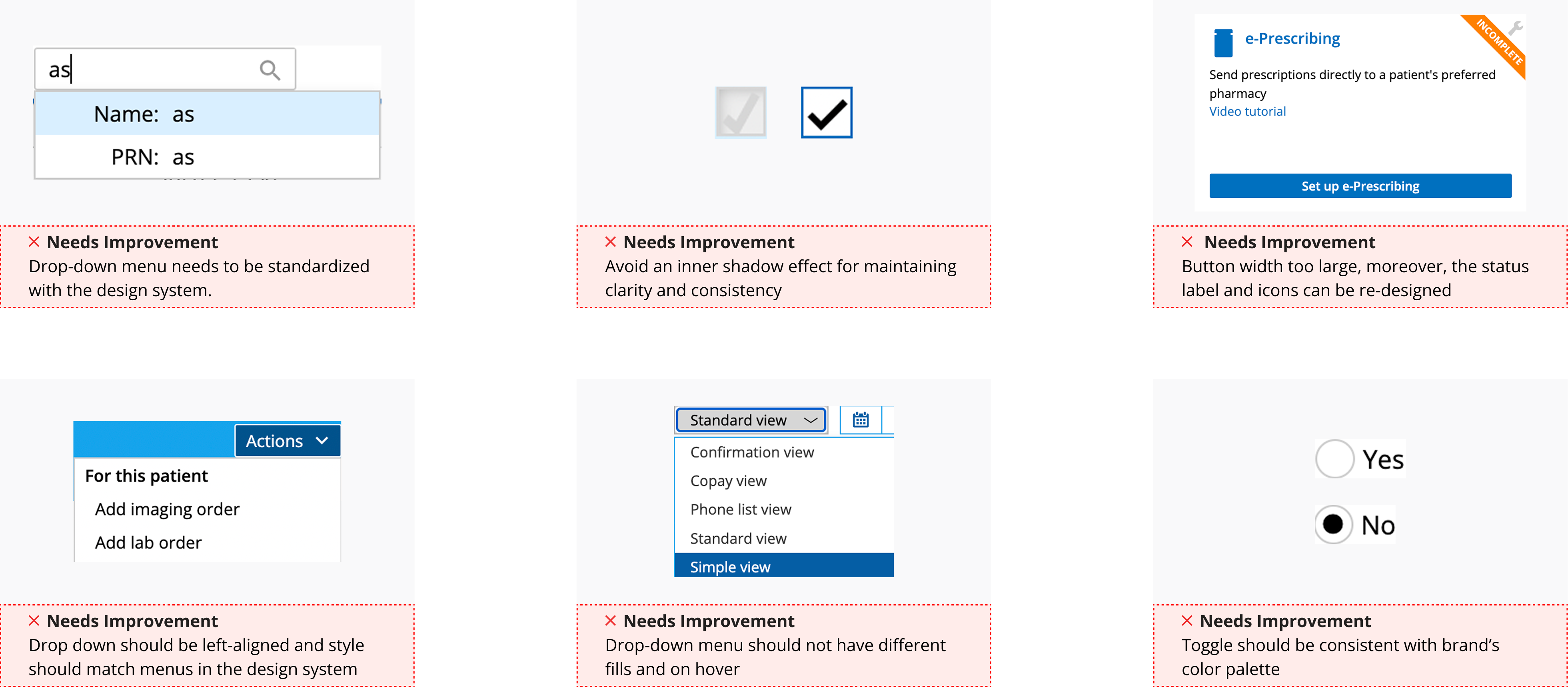
UX Audit
I conducted a thorough audit of existing components across Practice Fusion’s platform. This involved cataloging UI elements, identifying inconsistencies in typography, spacing, colors, and interaction patterns, and assessing their usability against industry best practices.
Grid System
Desktop 1440px
12 Columns
Column Width: 74px Gutter: 32px Columns: 12px
Typography
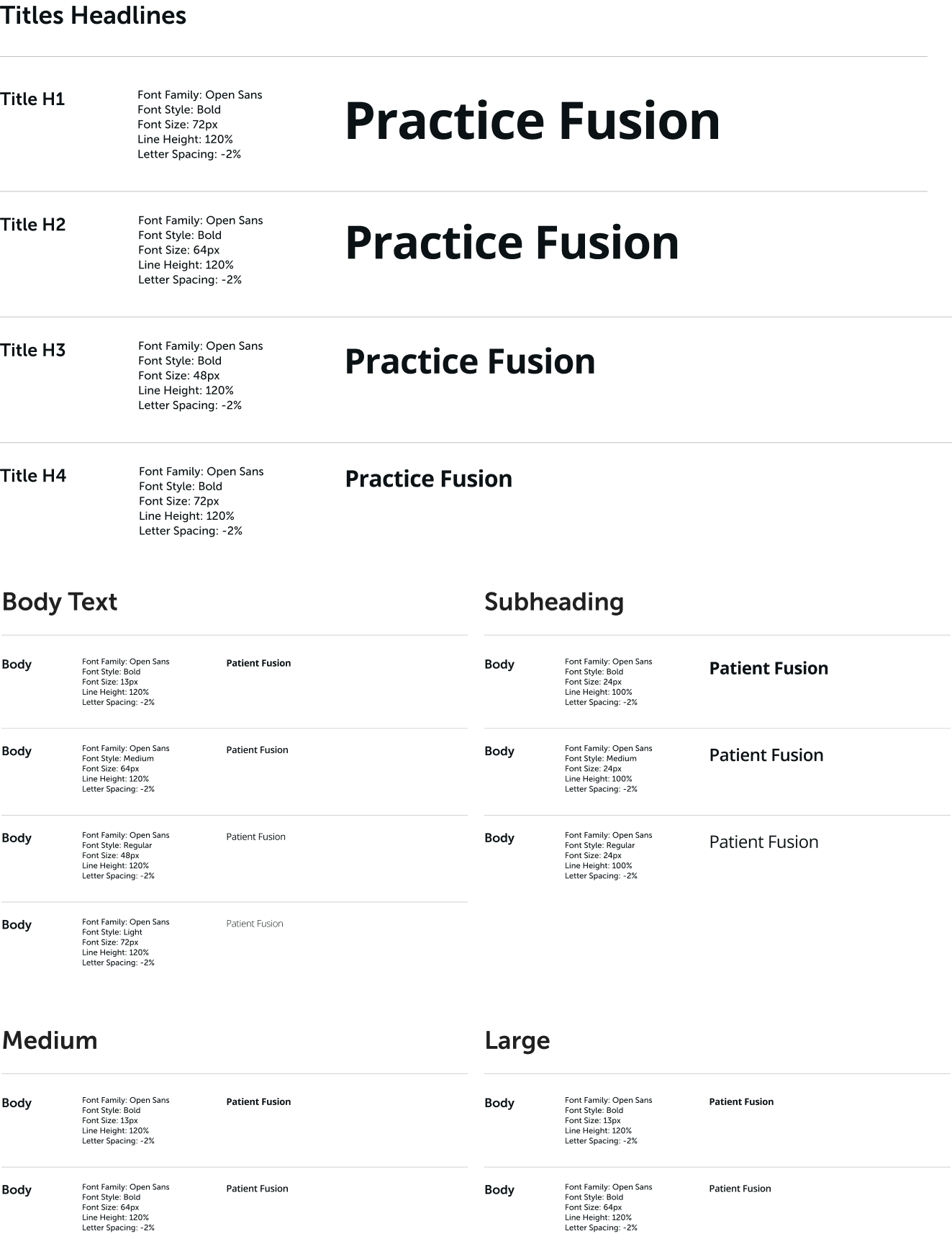
I identified inconsistencies in typography across the Practice Fusion platform, with varying font sizes, weights, and line heights disrupting visual hierarchy and readability. To address this, I established Open Sans as the primary typeface, ensuring a clean, modern, and highly legible text style suitable for healthcare interfaces.
Color Palette
I defined a structured palette consisting of Primary, Secondary, and Alert colors, ensuring uniformity across the platform. The Primary colors established brand identity, while Secondary colors provided flexibility for UI accents and interactive elements.
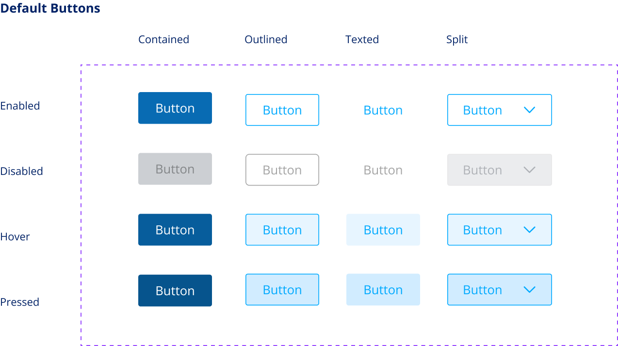
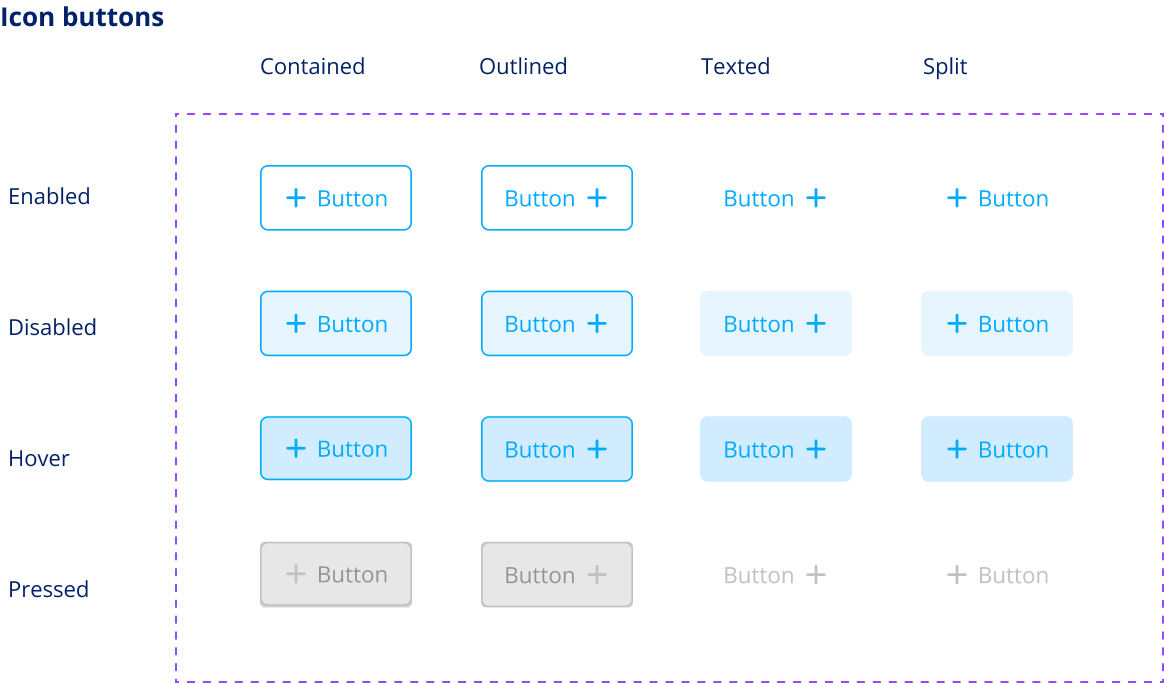
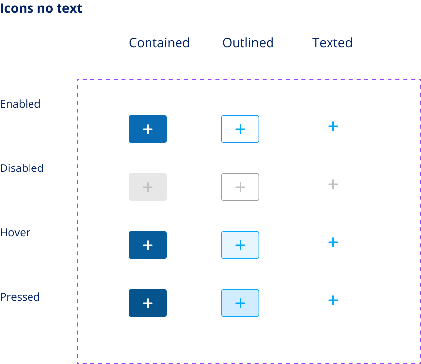
Buttons
The UX audit revealed inconsistent button styles, with variations in size, color, and states causing confusion and inefficiencies across the platform. To streamline interactions, I established a scalable button system with a clear hierarchy, including Primary, Secondary, and Tertiary buttons, each with distinct use cases.
Artifacts
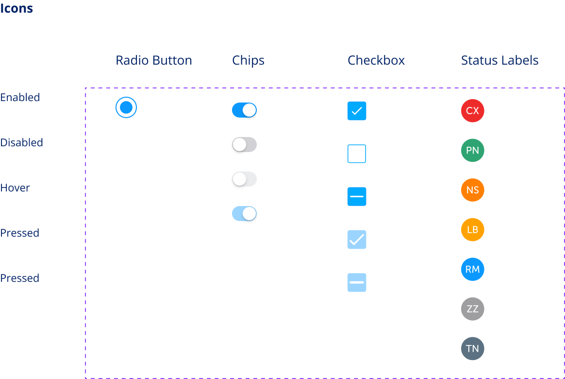
To ensure seamless adoption and scalability of the design system, I created a comprehensive set of artifacts and documentation. This included a Figma component library with detailed guidelines on usage, spacing, and responsive behavior
Re-Design
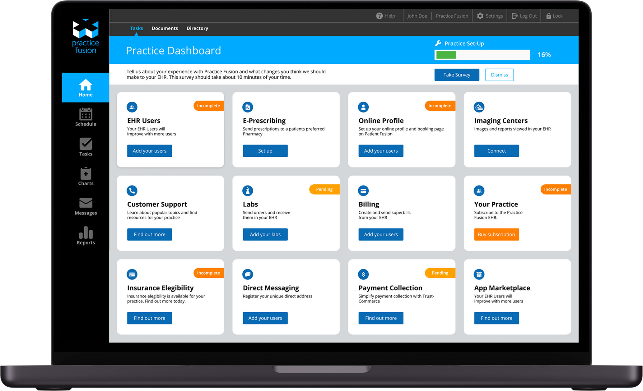
I redesigned the dashboard layout to optimize the viewing experience and improve seamless navigation. The new structure enhances information hierarchy, allowing users to quickly access key features and data with minimal cognitive load. Additionally, the newly developed design system components were systematically implemented across all screens, ensuring a consistent, user-friendly experience while maintaining scalability for future updates.