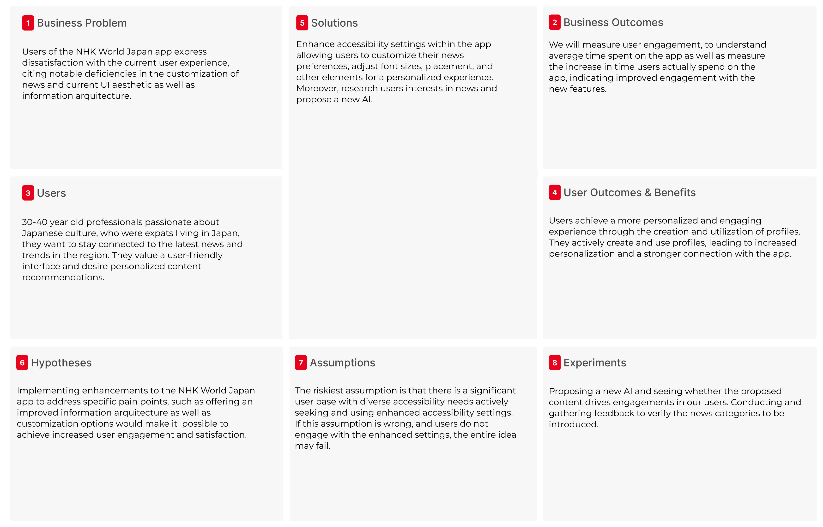
For this project, I re-designed the NHK news app to enhance user experience and engagement for a foreigners. Through comprehensive research into user needs, I optimized the UI for easier navigation, personalization, and faster access to news.
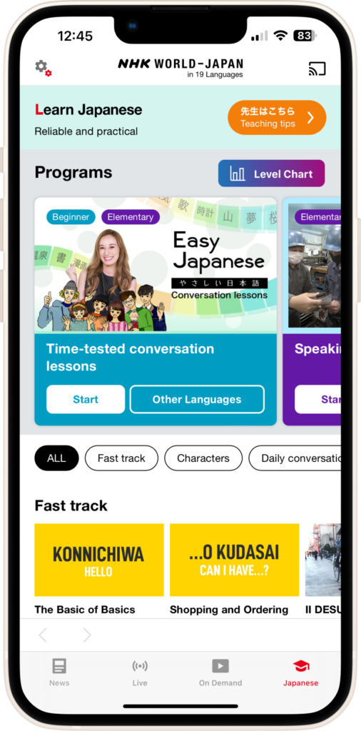
NHK provides the latest information on Japan and Asia through television, radio and online to a global audience as well as offers over 19 different languages to its entire audience.
I carried out a comprehensive research into the needs of the users in order to optimize the UI so that it can lead to long lasting habits for the readers of NHK and help them stay up to date with the latest news.
Problem
Inconsistencies in the platform for the user to search for information about local occurrences and international news. Lack of bookmarking features.
UX Heuristic Analysis
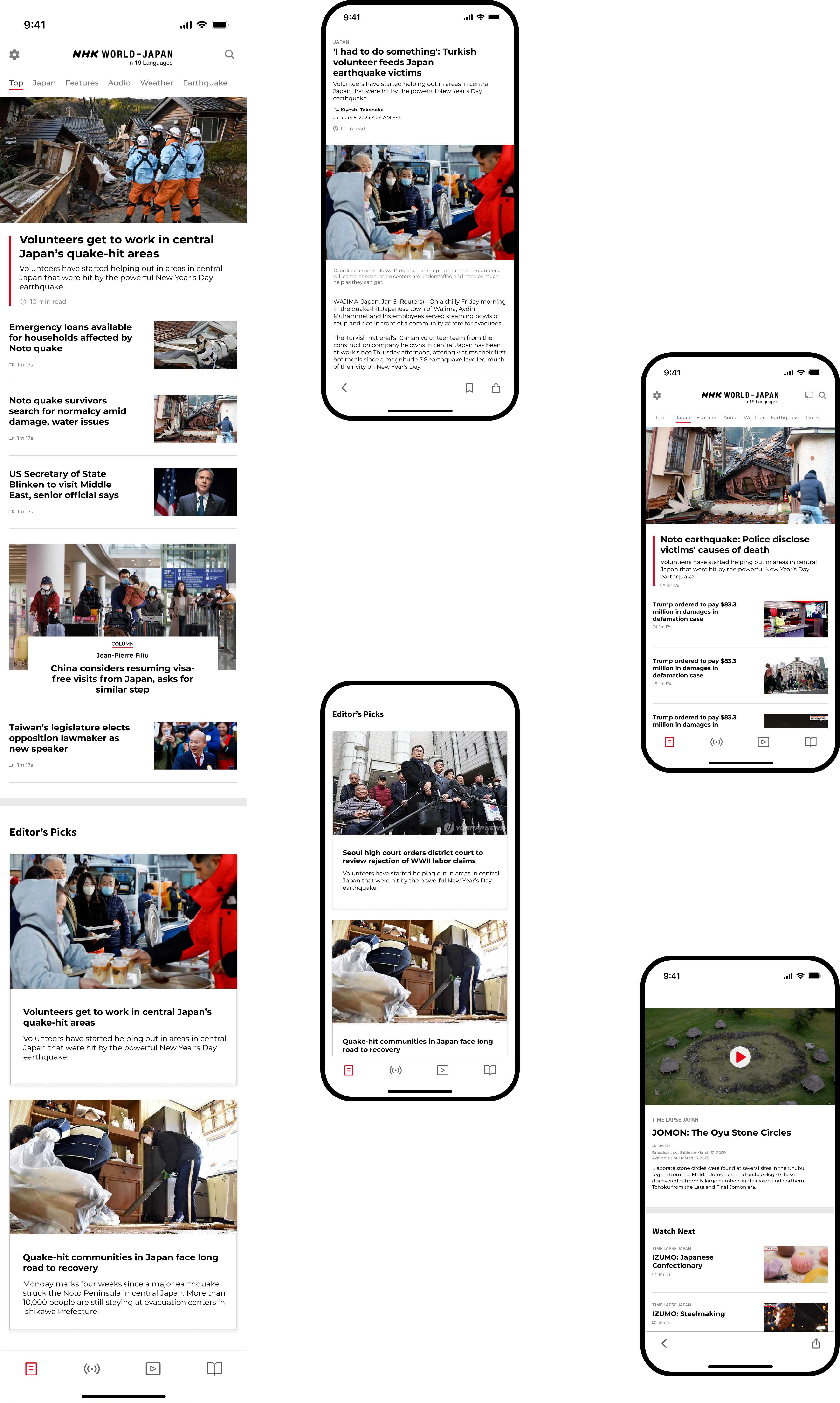
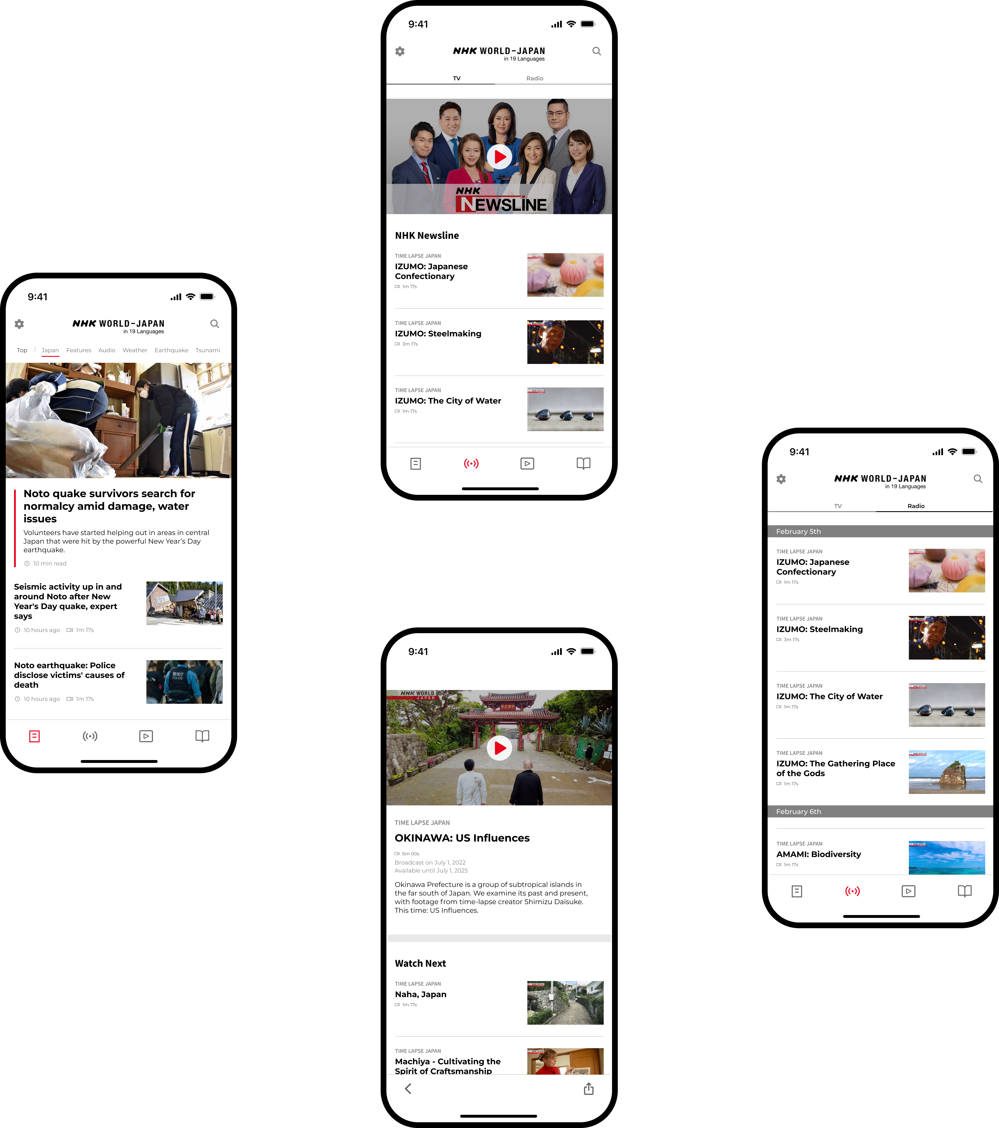
Bottom app bar navigation icons are inconsistent
Top menu bar font is small and lacks contrast
Finding 1 - Improved bottom navigation
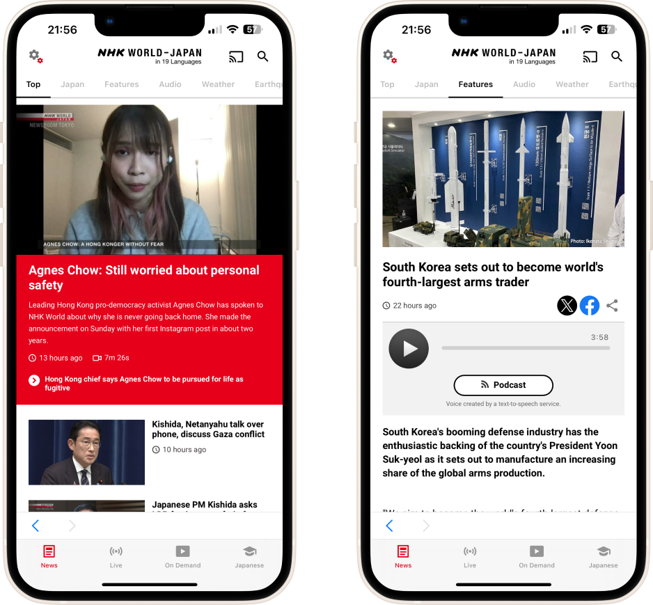
The app’s bottom navigation bar exhibits inconsistencies in icon design, with variations between filled and stroked icons in their respective active states.
The top menu bar, which showcases news categories, presents readability challenges due to insufficient contrast and a relatively small font size
Violated Heuristics: Aesthetic and minimalist design Consistency and standards
Finding 2 - Layout conflicts
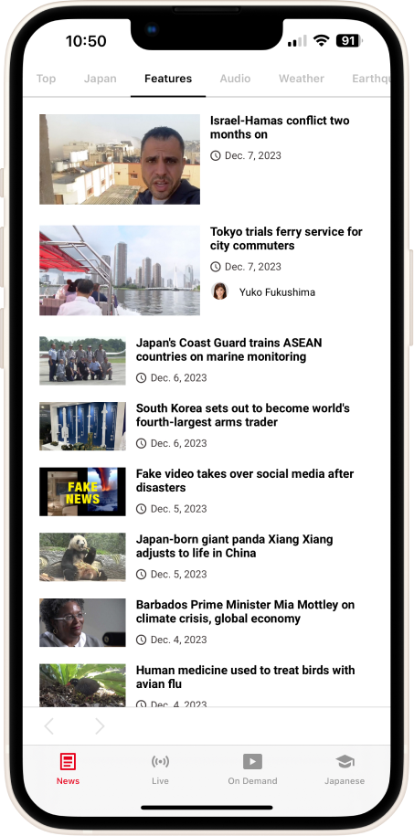
There are layout problems that affect the natural left-to-right reading pattern. This impacts readability.
Inverting the arrangement of the thumbnail and heading aligns better with user expectations.
Violated Heuristics: Match between system and the real world
F-pattern violation.
Non-functional forward button
Finding 3 - Nav Buttons
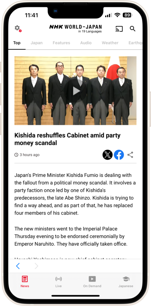
Inactive state of the forward button appears when the user clicks on an article for the first time. This is unintended, as there is no subsequent article to navigate forward to at this point in the user journey.
Violated Heuristics: Consistency and standards
Finding 4 - Visual Language
Certain pages misaligned with the overall app and web design.
Color palette is not standardized.
Violated Heuristics: Aesthetic and minimalist design
Consistency and standards
Discrepancy in Visual Language
User Testing
The next step after prototyping we began our testing. For that, we used a great online tool UserTesting.com. Setting up the survey we requested the system to invite participants who:
During testing, contributors evaluated the implemented features aimed at making the job-searching process more enjoyable. However, usability issues were encountered during this evaluation phase. While the concept of gamified features received positive feedback from participants, they found the structure of the screens to be confusing and misleading. Consequently, a findings report was generated to document and address these identified issues
Critical Issues
News categories displayed in “Top News” are not necessarily the most important ones in the navigation menu.
Users expressed a desire for features such as user profiles for more personalized content and customization.
The main features of a news apps should include easy to see headlines, clear layouts and optimized readability.
Language learning feature redirects to website. User preference is to access this content directly in the app.
Solutions
Create a new information arquitecture that caters to the needs and interest of the user group.
Introducing user profile creation for customizations and personalized content recommendations.
Re-designing the layout of articles and thumbnails will allows improved readability to follow a natural left to right reading pattern.
Enhance the user-friendliness of the Japanese language learning UI to encourage users to stay within the app.
Surveys
We conducted 15 unmoderated user interviews and found the following pain points. Have strong interest over certain news categories more than the ones being currently displayed in the navigation menu.
Do not recommend NHK News app
Would not use a bookmarking feature to access and mark preferred news content
Would like to have more customization over their news
Do not utilize bookmarks to save their news content
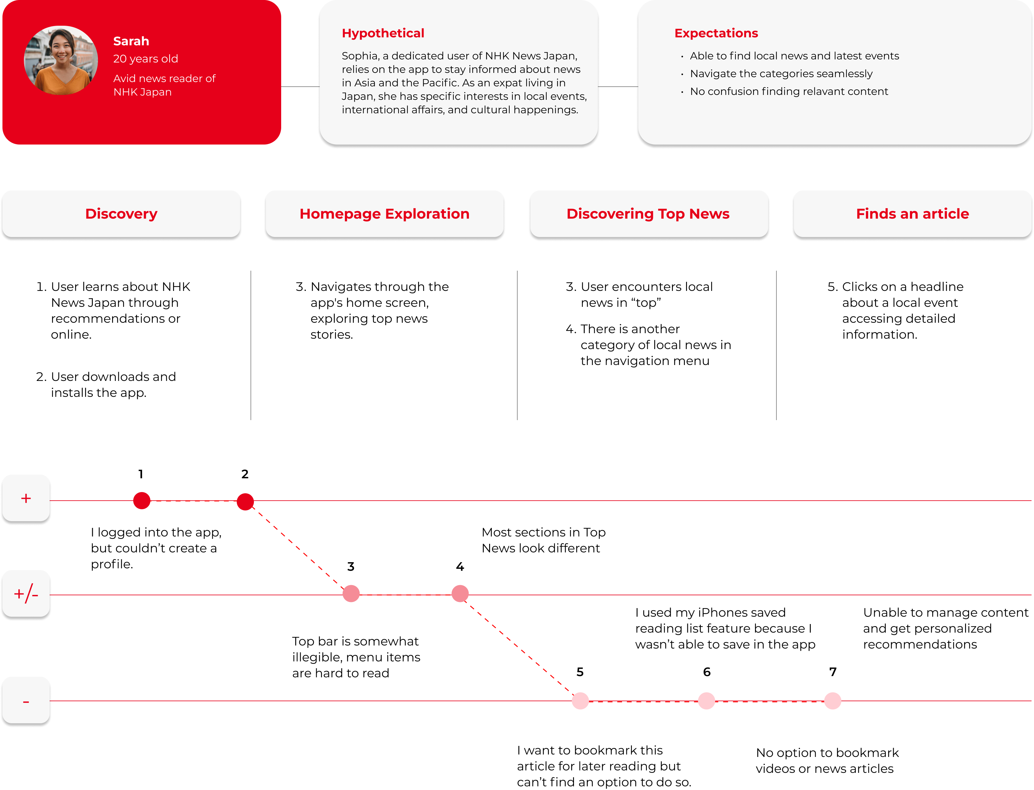
User Persona – Sarah
To create the most reliable persona we conducted interviews to expats residing in Japan as well as people with interests in Asia.
Wants and Needs
Olivia is an avid consumer of news and cultural content related to Japan and Asia.
Values a well-organized and efficient system for managing her preferred content.
Seeks to find news articles seamlessly, values a clear layout.
Bio
Sarah is an expat and an avid consumer of news and cultural content related to Asia. She stays up to date with the latest news in the region via the NHK app. She also checks international news as well as local news.
Behavior
She values a well-organized and efficient system for managing her preferred content. Seeks improved bookmarking features, user profiles, and playlist creation functionality for a more seamless content management experience.
Pain Points
Often finds the same content on different tabs in the navigation menu. Desires the ability to customize her content recommendations. Has difficulty finding news categories within the app.
User Journey Map
UX Lean Canvas
One of the most important parts of of my research was creating a Lean UX canvas. We analyzed competitors, indentify possible strenghts and weaknesses.
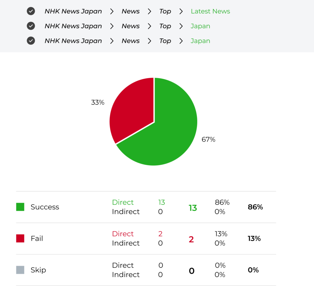
Tree Testing
Task #1
There was recently a major earthquake incident and you want to read about these news, where can you find this article?
Conclusion
My tree test results show that users are likely to search for local news in either “Latest News” or the navigation tab “Japan”. Moreover, there is a repetitive use of news sections in the app.
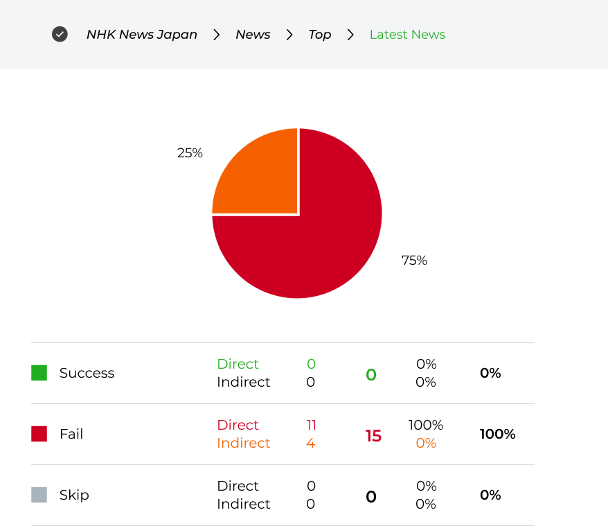
Task #2
You found out through a friend that there was a major event in the eurasian continent, you want to read about these news. Where can you find this article?
Conclusion
Most users expect to either find international news in “Latest” or have a separate tab with international news, as indicated by my quantitative research. This appears to be the most important news category.
Site Map – NHK (Updated)
Image 2: Earnings, Profile and Payments screens.
Montserrat
Regular
Bold
I opted for the Montserrat font in my news case study because of its sleek and contemporary design, which greatly enhances readability and visual appeal in digital content. The geometric sans-serif style gives off a modern and professional vibe, elevating the overall presentation of my news articles. Montserrat’s versatility is a key factor, ensuring a consistent and enjoyable reading experience across various devices and screen sizes. Its well-balanced proportions and distinctive letterforms contribute to a polished and contemporary aesthetic, perfectly aligning with the visual expectations of a news-oriented project.
FONTS
Usability Tests
Task #1
Testing Type: Moderated remote testing
Conclusion
My tree test results show that users are likely to search for local news in either “Latest News” or the navigation tab “Japan”. Moreover, there is a repetitive use of news sections in the app.